
Creating a cohesive pharmaceutical platform
Quick Summary
Problem: Phone-based pharmaceutical ordering led to overstocking, delays, and high operational overhead
Approach: Built a real-time inventory and ordering platform enabling direct ordering and end-to-end visibility
Role: UX, workflow design, stakeholder coordination, front-end implementation
Outcome:
35% increase in revenue booked in the first quarter post-launch
28% reduction in overstock value
Higher adoption across hospital and pharmacy clients
Streamline the order creation and fulfillment process to minimize operational overhead while accelerating customer delivery timelines.
Create a transparent inventory system that connects clients and vendors, offering real-time stock visibility to streamline ordering and fulfillment processes.
Interaction Design
Interface Design
Mobile Development
Stakeholder Management
Prototyping
UX Research
Figma
HTML
CSS
Angular
Ionic with Angular
ClickUp
Pharmacists
Internal Warehouse Managers
Internal Sales Team
Hospital Administration
Pharmacy Managers
Timestream Technologies is a tech-first organization specializing in enterprise-level healthcare solutions. Our offerings include software for managing healthcare institutions, such as hospitals, specialized departments, clinics, pharmacies, laboratories, and radiology centers. With our order management app, we aim to keep clients and our sales team aligned in real time. Clients can view medical supply inventory, place orders accordingly, and even request out-of-stock medicines. This helps us minimize overstocking while ensuring seamless fulfillment.
One of Timestream Technologies’ key offerings is an order management suite for pharmaceuticals and medical supplies. However, we encountered major challenges with on-time order fulfillment and overstocking. Our research revealed that our warehouse was holding more than double the necessary inventory, leading to storage inefficiencies and complications in returning unused products to vendors.
Further investigation uncovered a fundamental flaw in our procurement process: our system was built around the traditional ordering methods of pharmaceutical vendors in India—placing orders via phone calls. With 100+ clients relying on us, managing these verbal transactions created bottlenecks, miscommunications, and delays. The lack of a structured ordering system meant we had to overstock goods to meet unpredictable demand, further exacerbating inefficiencies.
Challenges identified: Overstocking, manual errors, lack of visibility. Each mapped to a UX goal: reduce stockouts, automate alerts, simplify dashboards.
The focus of our entire application is inventory management, so we looked at various software that specialize in inventory management for medical supplies. The objective was to figure out how they were handling copious amounts of information required to identify medicines but keeping things simple enough to not overwhelm a user.
Maps products with physical locations
Can map distribution centers, but not direct to clients
Price comparisons between distributors
Bulk medicine orders
Stock status indicators
Salt information available at all times with compositions
Repeat orders/Frequent ordering
Each product details can be viewed to see more information
Acts as a medicine knowledge database as well
Easy exports of past orders and SKUs
Easy order tracking with item and order level statuses
Shortage information available when placing orders
As the software is primarily going to be running in B2B scenarios, particularly the pharmacies that have our existing software, we felt it would be more fitting to create user profiles around the roles they represent rather than creating personas around user behaviors. This allows us to know which users are meant to be given training to for which parts of the software and also narrow down on their daily operations
For this case study, we will be looking at the workflows and processes from the point of view of a pharmacist.
Key Pain Points
🛑 No Direct Ordering Control
Pharmacists can’t place orders directly and must rely on sales reps, leading to unnecessary delays and frustration.
🔄 Too Many People, Too Many Steps
The process involves juggling multiple contacts—warehouse staff, managers, sales reps, and accounts—just to place a single order.
📉 Manual Verification Burden
Stock levels in the system don’t always match reality, forcing pharmacists to manually verify quantities and check with vendors.
🚚 No Real-Time Updates
Once an order is placed, pharmacists are left in the dark. Updates only come if a sales rep reaches out, making it difficult to anticipate deliveries.
⚙️ Inefficient & Tedious Workflow
With fragmented communication, manual approvals, and no centralized ordering system, the process feels more complicated than it should be.
The Impact
💢 Frustration from lack of autonomy
📞 Exhaustion from excessive back-and-forth communication
⏳ Delays that slow down essential medical inventory management
After understanding all the pain points of our core users, we started developing possible workflows that could alleviate the load from sales people and alert users about our stock status. The key concept was ensuring all pharmacy admins and stakeholders could create orders directly. This required an application capable of tracking all orders made by any hospital stakeholder at any given time.
Our key focus areas for the project were:
The following sketches are a part of the process of the entire order management application. These designs give us a glimpse into the potential workflow, focusing on the primary functionality that we want to cover.

Our mid fidelity wireframes showcase the feedback we got from the users to make sure that we cover all of the core workflows and requirements. The goal is not a fully finalized design system, but just the overall layout and functionality.

With our mid fidelity wireframes, we converted them to prototypes and tested them with our users and all stakeholders to ensure we were on the same page. In this section, just the main improvements/design decisions implemented to improve the experience will be mentioned.
Users wanted the ability to quickly overview all orders with their status in an easy-to-read format. For this, we decided to create borders for all the orders and maintain the color coding that already exists in our software. This would allow the users quickly recall each status without having to spend extra time trying to understand the status.
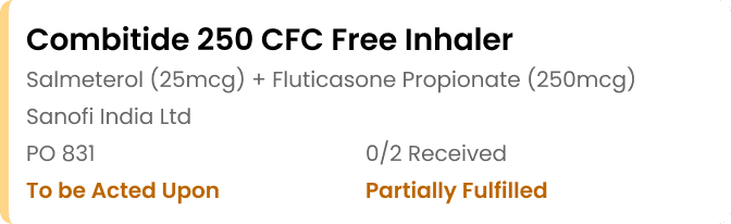

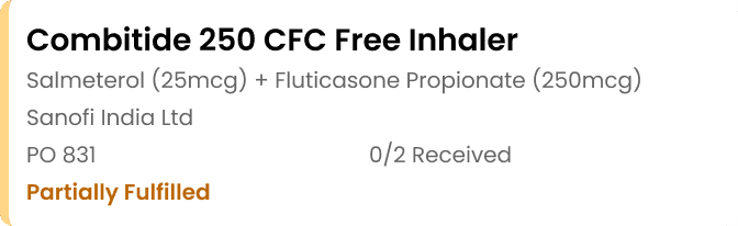

Users also wanted the ability to have access to quick actions for the orders that are active. Further research on our end revealed that most mid size healthcare organizations using our software did not have more than 3-5 active orders at a given time. While the orders are not cancelled frequently, there are some cases where senior management blocks an order and the order has to be terminated. Giving the users quick access would allow them to focus on just the information regarding the order rather than trying to find ways to terminate the order.

Users also wanted the option to view the number of actions needed for any particular section This would draw the users attention to any given section to address any situation that might require their input.



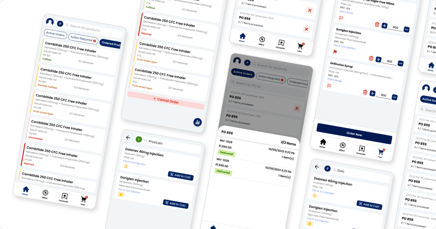
The screens showcased below are some of the final screens that were implemented in the final application. The design system utilized was the existing design system for our web application, extended to handle some mobile use cases like status indicator cards.
We debated complex dashboards vs simplified views. We chose simplicity for launch, knowing we’d add complexity later.


Reflection
At the time of writing, the application and web platform have been in the market for over a year (Release date of January 2024). Some of the main impacts include:
Revenue booked increased by just over 35% in the first quarter of launch
Overstock items value reduced by approximately 28% in the first quarter of launch
Increased adoption rate of order management and pharmaceutical goods supply solution from our organization.
Traditional pharmaceutical systems require carefully managed digital transformation, especially in markets like India.
User research quality in certain scenarios depends on established trust relationships, affecting the honesty of feedback received.
Balancing comprehensive medical information with interface simplicity remains a core UX challenge in healthcare applications.
Solutions for one problem area (ordering) created positive cascading effects across related systems (inventory, communication).
Deep operational context (like typical order volumes) informed better interface decisions than user preferences alone.
This project reinforced the importance of system-level design. A future improvement would be integrating analytics dashboards directly into workflows.
