

Encourage conscious spending habits by helping users reflect before making impulse purchases. The goal was to design an application that promotes accountability in personal finance by tracking spending intentions versus actual spending, and helping users visualize savings progress over time.
thinktwice aims to prevent excessive shopping behavior by introducing micro-interventions: users can block shopping platforms and receive gentle prompts to reconsider their purchases. When they choose to proceed, they’re encouraged to log their intended and actual expenses to understand their spending patterns and cumulative savings.
Interaction Design
Interface Design
Stakeholder Management
Prototyping
Figma
FigJam
Currently users that identify as women, plans to expand to further audiences.
thinktwice was built from scratch as the first iteration of an app that helps users develop mindful spending habits. The idea stemmed from observing real-life behavior and researching the psychology behind impulse shopping, where small, seemingly harmless purchases quickly accumulate into larger financial setbacks.
Rather than using guilt or restriction, thinktwice takes a friendly, habit-building approach. Users log their spending manually, track their savings goals, and receive gentle feedback through a cute avatar that reflects their financial choices. Progress bars, encouraging copy, and positive nudges create an experience rooted in self-awareness and consistency—helping users form sustainable habits and feel rewarded for every mindful decision.
Our behavioral research and user observations revealed that impulse shopping often stems from emotion rather than need. Many users felt a brief sense of satisfaction after buying something small but were later met with guilt when they realized how quickly these unplanned expenses added up. Despite being aware of their goals, they lacked daily visibility into how small purchases were affecting their progress.
Early exploration into blocking apps and tracking usage confirmed that purely analytical solutions could not drive change. While users appreciated statistics, they connected more deeply with emotional feedback and visual cues. This insight led us to reimagine thinktwice as a gentle companion that helps users reflect instead of restrict. By focusing on self-awareness, relatable prompts, and visual motivation through avatars and progress tracking, we shifted the experience from financial control to behavioral mindfulness.
During our research, we found that existing applications in the space primarily focused on time-based app blocking. These tools allow users to restrict access to shopping or social media platforms for specific hours of the day but rarely address the underlying behavior that drives impulsive spending.
Most solutions approached the problem as a matter of productivity rather than habit formation. They lacked emotional context, personal reflection, or progress tracking—key components for sustainable behavioral change. thinktwice was designed to fill that gap by pairing conscious decision-making with encouragement, helping users not only pause but understand why they spend.
Allows users to block applications
Can work for any application
Not suitable for shopping as financial goals aren't tracked
Uses emotional nudges
Stats are lacking.
Tracks user spending accurately
Cannot block applications
No nudges in any direction
Stats are extremely detailed and related to financial data
Since thinktwice was built as a direct-to-consumer habit-forming app, we focused on understanding emotional triggers and behavioral barriers rather than organizational roles. Informal research and early prototype feedback revealed common patterns among our core users.
Key Pain Points
💸 Untracked Micro-Spending
Small, frequent purchases felt insignificant individually but added up quickly, derailing savings goals.
😔 Guilt Without Awareness
Users felt bad about overspending but couldn’t see why or how it was happening across the day.
📱 Ineffective Time-Based Blockers
Existing solutions only restricted access for set hours, failing to address emotional triggers behind spending.
🙈 Lack of Reflection Moments
There were no tools prompting users to pause and think before buying, limiting opportunities for mindful decision-making.
🔁 Difficulty Sustaining Motivation
Without feedback or visible progress, users struggled to stay consistent in reducing impulsive purchases.
The Impact
✨ Users paused and reflected before spending after blocker prompts.
📊 Small daily spends became visible through tracked insights.
🧠 Avatar feedback built natural, consistent spending habits.
💬 Friendly copy made saving feel positive and motivating.
The workflow for thinktwice was built around a balance of linear setup and continuous behavioral loops. While onboarding and settings follow a straightforward flow to help users set financial goals, choose apps to block, and customize their avatar, the core experience revolves around a recurring loop of reflection and accountability.
Each time users attempt to open a blocked app, they’re met with a friendly prompt that encourages them to pause and reconsider. If they proceed, they’re guided to log their intended and actual spending, closing the loop with visual feedback through their avatar and progress tracker. This design reinforces awareness while keeping the experience light and non-judgmental.
Emotional prompts and contextual triggers such as goal completions or savings milestones, help maintain momentum and celebrate progress. Together, these interactions form a sustainable habit loop that turns spending reflection into a natural, repeatable behavior rather than a forced restriction.
Goal Tracking
Set spending goals, deadlines, and savings targets to stay focused and motivated.
App Blocking
Select shopping apps to block and receive gentle prompts before impulsive purchases.
Spending Reflection
Log intended vs. actual spending after bypassing blockers to understand spending habits.
Avatar Feedback
See your avatar react to spending decisions, reinforcing accountability through emotion.
Progress Dashboard
Track cumulative savings and visualize how close you are to completing your goals.
Referral System
Unlock new avatar outfits and accessories by inviting friends to join thinktwice.
The following screens were the rough layouts and workflows we had initially thought of when making the application. It gives us an idea of a potential approach we could have taken and ended up refining it.
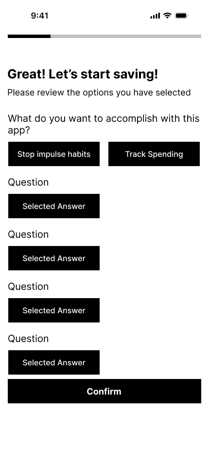
Savings object did not capture user’s intent fully

Savings goals in the beginning were quite vague

Initial dashboard was much more stats focused

App blocking/bypass was initially going to be based around time frames
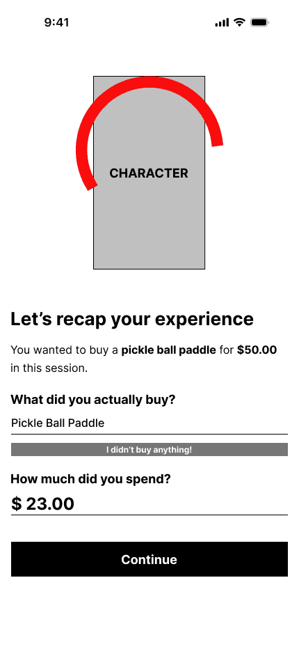
Session recap remained largely the same through all iterations
Our mid fidelity wireframes showcase the feedback we got from the clients and protypes to make sure that we cover all of the core workflows and requirements. The goal is not a fully finalized design system, but just the overall layout and functionality.


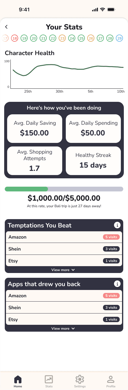
With our mid fidelity wireframes, we converted them to prototypes and tested them with our users and all stakeholders to ensure we were on the same page. In this section, just the main improvements/design decisions implemented to improve the experience will be mentioned.
With our mid fidelity wireframes, we converted them to prototypes and tested them with our users and all stakeholders to ensure we were on the same page. In this section, just the main improvements/design decisions implemented to improve the experience will be mentioned.


To build user trust, we introduced complete timeline transparency. Every checkpoint now includes expected dates, clear milestones, and visible progress updates. Goals are broken into smaller, manageable phases so users don’t feel overwhelmed, with clear indicators showing how long their current saving streak needs to continue to reach the target.


To help users maintain focus and avoid scattered efforts, we limited them to one active goal at a time. If a user wishes to start a new goal, they must first close the existing one—either by confirming completion through extra funds or acknowledging a shift in priorities. This keeps the experience intentional and focused.


A completely new design system was created to be used throughout the application. Below are some of the final screens with all updated designs along with parts of the design system.


At the time of writing (October 2025), the application is still being tested at scale and will be expecting a full launch soon. Some of the impacts witnessed in the round of final testing are:
Users strongly connected with the avatar concept and friendly tone.
The app felt encouraging and forgiving, even when goals weren’t fully met.
Users viewed thinktwice as a supportive tool for long-term mindfulness.
Real-world spending habits vary widely, requiring flexible design choices.
Building trust is essential when addressing financial behavior.
Tone and positioning must feel positive, not restrictive.
Future updates will add avatar customization and optional spending tracking.
The app continues to gather feedback to refine user experience.
